
Maximizing Mobile UX: Best Practices for 2025 and Beyond
Table of Contents
Looking for mobile UX best practices that actually work? Your website has just seconds to make a first impression, and chances are, that impression is happening on a mobile device. As a WordPress developer and SEO specialist here in Sioux Falls, I’ve seen how mobile-friendly websites directly impact business success.
Let me share something striking: Google’s research shows that even a fraction of a second improvement in mobile performance can increase your conversion rates by 8.4% and keep visitors engaged longer.
Why Mobile UX Matters Now More Than Ever
Think about the last time you looked up a business on your phone. Was the website easy to use? Could you find what you needed quickly? If not, you probably left – and you’re not alone. In 2025, a smooth mobile experience isn’t just nice to have… it’s essential for business growth.
Essential Mobile UX Best Practices for 2025
Smart Personalization
Remember the last time Amazon recommended exactly what you were looking for? That’s smart personalization at work. Today’s websites can provide similarly helpful experiences while respecting user privacy. By understanding how visitors interact with your site, we can create intuitive experiences that make it easier for them to find what they’re looking for – all while maintaining strict privacy standards.
This approach leads to more engaged visitors and better conversion rates for your business, without compromising user trust or collecting unnecessary personal data. As a strong advocate for online privacy, I ensure your website serves your visitors’ and your business needs while protecting their privacy rights.
Fast and Responsive Design
Your customers expect instant results. If your website takes more than three seconds to load, you’re likely losing half your visitors. Modern mobile design isn’t just about looking good, it’s also about performing well. As your web developer, I ensure your site loads quickly and responds instantly to user interactions.
Enhanced Privacy and Trust
In today’s digital landscape, your customers are increasingly concerned about online privacy – and they should be. The average website includes seven ad trackers and three third-party cookies that monitor visitor behavior. At East West Designs, I take a different approach.
A recent Blacklight Privacy Inspector Report of eastwestdesigns.net revealed:
- Zero ad trackers (compared to an average of seven on popular sites)
- No third-party cookies (compared to an average of three)
- No keystrokes captured
- No session recording services
- No Facebook Pixel
- No Google Analytics remarketing
- No ad-tech companies present
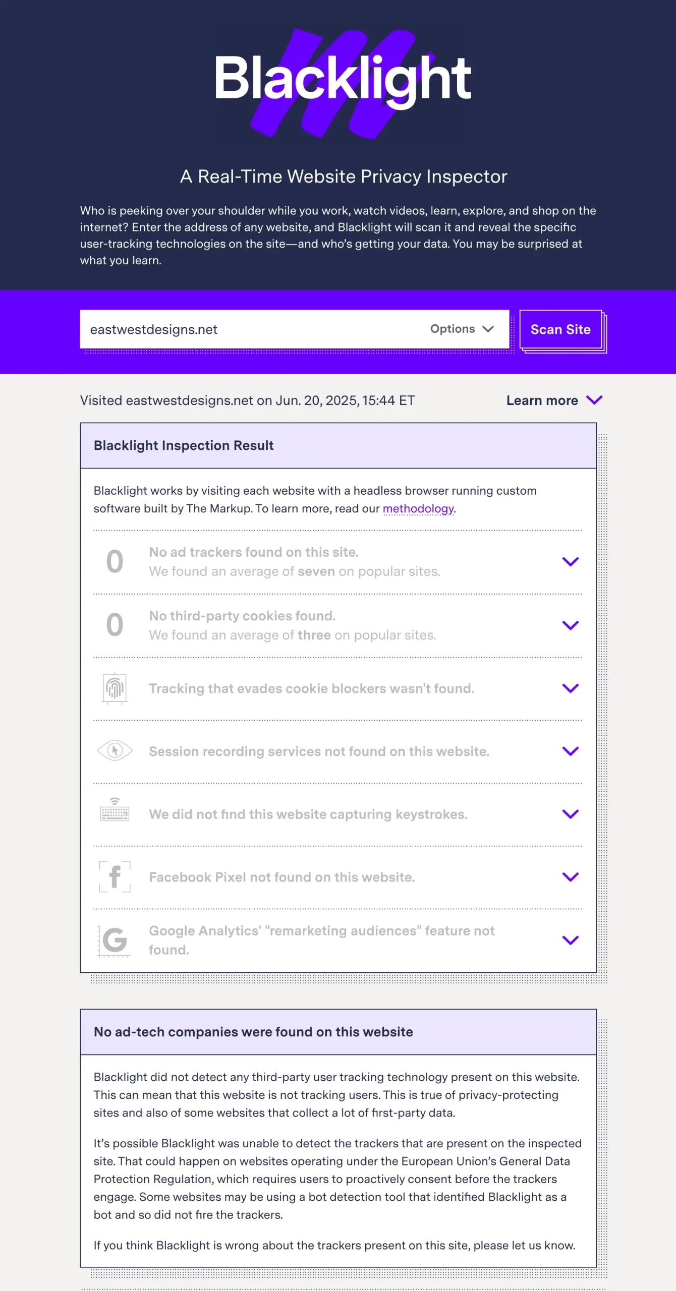
This isn’t just about displaying privacy badges or compliance statements – it’s about genuinely respecting your visitors’ privacy. When I build your website, I implement privacy standards that make sense for your business while protecting your visitors. Your site can be effective and engaging without relying on invasive tracking methods that compromise user trust.
How We Create Mobile-First Experiences
Let me share two recent projects that showcase effective mobile design:
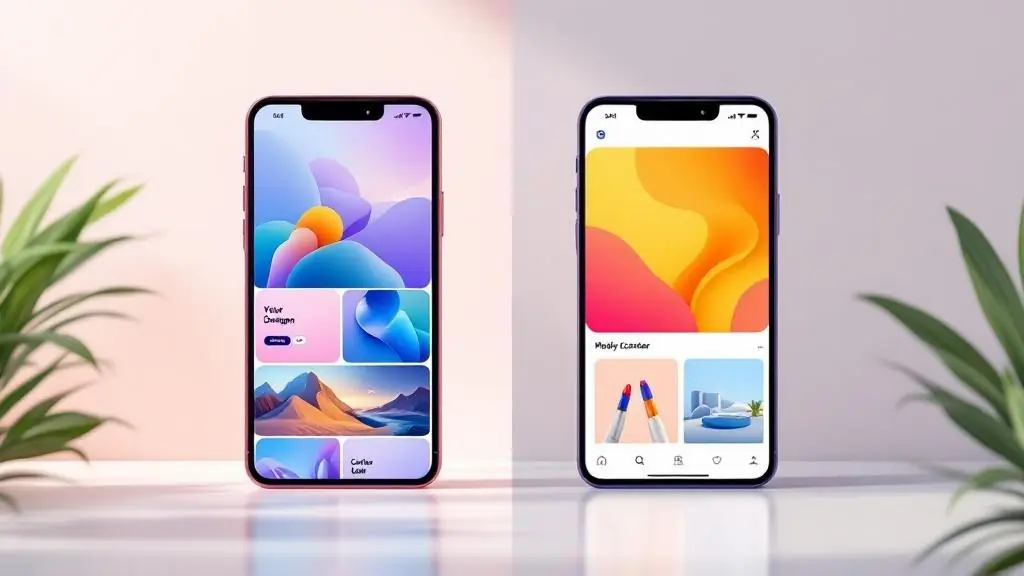
East West Designs Portfolio
When redesigning my own portfolio, I focused on:
- Quick-loading images that look sharp on any device
- Easy-to-use filtering to help visitors find relevant work
- Smooth transitions that make browsing enjoyable
- Touch-friendly buttons and menus
Fixit Home Solutions Website
For this local business client, we prioritized:
- Clear before/after project showcases
- Fast-loading gallery for project photos
- Easy contact options for potential customers
- Location-based service area information
Making Navigation Work for Your Customers
When visitors come to your website, they’re looking for something specific. Whether it’s your services, contact information, or pricing, they should find it quickly and easily – especially on mobile devices. Let me show you how we make this happen.
Smart Menu Design
Your website’s menu is like a roadmap for visitors. Well designed mobile menus will:
- Put your most important information front and center
- Adjust to how people naturally hold their phones
- Stay accessible without cluttering the screen
- Guide visitors to take action, like making a call or booking a service
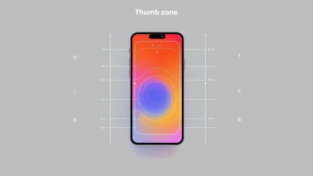
Touch-Friendly Features
Have you ever tried tapping a tiny button on a website and hit the wrong thing? That’s poor mobile design. Every button and link on your site should be:
- Easy to tap without zooming
- Spaced properly to prevent mistakes
- Instantly responsive to touch
- Clearly visible against any background
Performance That Keeps Customers Engaged
Every tap, swipe, and scroll should feel smooth and natural. We achieve this by:
- Ensuring instant response to interactions
- Minimizing load times between pages
- Making sure everything works as expected
Organizing Content for Maximum Impact

Above-the-Fold Impact
Those first few seconds when someone lands on your site are crucial. We prioritize:
- Your most compelling message or offer
- Clear calls to action
- Quick access to key information
- Essential contact details
Smart Content Display
Nobody likes to be overwhelmed with information. We present your content in a way that:
- Reveals details progressively as visitors show interest
- Makes long content easy to scan
- Adapts to different screen sizes naturally
Location and Context Awareness
Your website should work smarter, not harder, adapting to your visitors’ needs, automatically showing location-specific information and the most convenient ways to contact your business based on how they’re browsing.
Making Your Website Work for Everyone
Easy Reading for All
Every visitor deserves a clear, comfortable reading experience. We ensure your content is easy to read on any device by using well-contrasted colors, automatically adjusting font sizes, and maintaining a clean, structured layout with clear headings. This thoughtful approach to typography and design helps visitors find and understand your information quickly, whether they’re on a phone, tablet, or desktop.
Keeping Your Website Future-Ready
Following mobile UX best practices isn’t just about today’s performance – it’s about building for tomorrow. Let me show you how I ensure your website stays current and effective as technology evolves.
Smart Technology Choices
Technology changes fast, but your website shouldn’t need constant updates. I use:
- Proven, reliable platforms
- Regular security updates
- Performance monitoring
- Scalable solutions that grow with your business
Continuous Optimization
Your website is an investment that should keep performing better over time. We provide:
- Regular performance checks
- Updates based on user behavior
- Security monitoring
- Ongoing optimization recommendations

Your Investment in Long-Term Success
When you invest in a website, you want to know it will continue performing well for years to come. My approach focuses on building sustainable, adaptable websites that grow with your business. Here’s how I ensure your investment keeps delivering value:
Proven Technology Choices
I build websites using WordPress, the platform that powers over 40% of the web. This means:
- Your site runs on thoroughly tested, reliable technology
- Regular security updates keep your site protected
- New features and capabilities are readily available
- You’re never locked into proprietary systems
- Your team can easily manage content updates
Built-In Growth Potential
Your business will evolve, and your website should adapt seamlessly:
- Flexible layouts accommodate new content types
- Modular design makes adding features simple
- Clean code ensures quick loading even as you grow
- SEO-optimized structure helps improve visibility
Ongoing Support and Optimization
A website launch is just the beginning. I can also provide:
- Regular performance monitoring
- Security updates and maintenance
- SEO performance tracking
- Guidance for future improvements
Partnership Approach
Unlike large agencies, I work directly with you to:
- Understand your business goals
- Provide personal attention to your needs
- Respond quickly to questions or concerns
- Share expertise and recommendations
- Help you make informed decisions
Ready to Build a Website That Works for Your Business?

As your developer, you get the best of both worlds: over 10 years of WordPress development expertise combined with certified SEO specialization. Instead of hiring (and coordinating between) a web developer and an SEO consultant, you get both skillsets working seamlessly together from day one.
What This Means for Your Business:
- Your website is built with SEO in mind from the ground up
- One point of contact for all your web and SEO needs
- Cohesive strategy across development and optimization
- More efficient project management
- Better value for your investment
Let’s Start Your Project
Whether you need a new website that drives results, want to improve your existing site’s performance, or implement optimized mobile UX best practices, I’m here to help.
Request a Free Website Proposal and let’s discuss creating a digital presence that serves your business goals. As your developer, I’ll focus on building a website that attracts your ideal customers and converts visitors into leads, while ensuring it ranks well in search results. Your site will be built to grow with your business, always respecting your visitors’ privacy.
Questions? Let’s Connect
“When you work with me, there’s no need to juggle multiple contractors for your website and SEO needs. Your website will be built with SEO in mind from day one, ensuring it’s both beautiful and optimized for search engines.”