
Why Mobile-First Website Design is a Must-Have for Businesses in 2025
Picture this: A potential customer discovers your business through Google search on their smartphone. They click on your website link, excited to learn more about your services. But within seconds, they’re pinching and zooming just to read your content, struggling to tap buttons that are too small, and watching images load at a snail’s pace. Frustrated, they hit the back button and move on to your competitor—one who understood the power of mobile-first website design.
This scenario plays out millions of times daily across the internet, costing businesses customers and revenue. In today’s mobile-first world, having a website that doesn’t adapt seamlessly to different screen sizes is an inconvenience for the customer, and a liability that directly impacts your bottom line.
If you’re a business owner or website manager who’s noticed declining mobile engagement, higher bounce rates, or missed conversion opportunities, this article will show you exactly why responsive design has become non-negotiable in 2025 and how to transform your mobile user experience into a competitive advantage.
Table of Contents
The Hidden Cost of Non-Responsive Design: Why Mobile Users Are Leaving Your Site
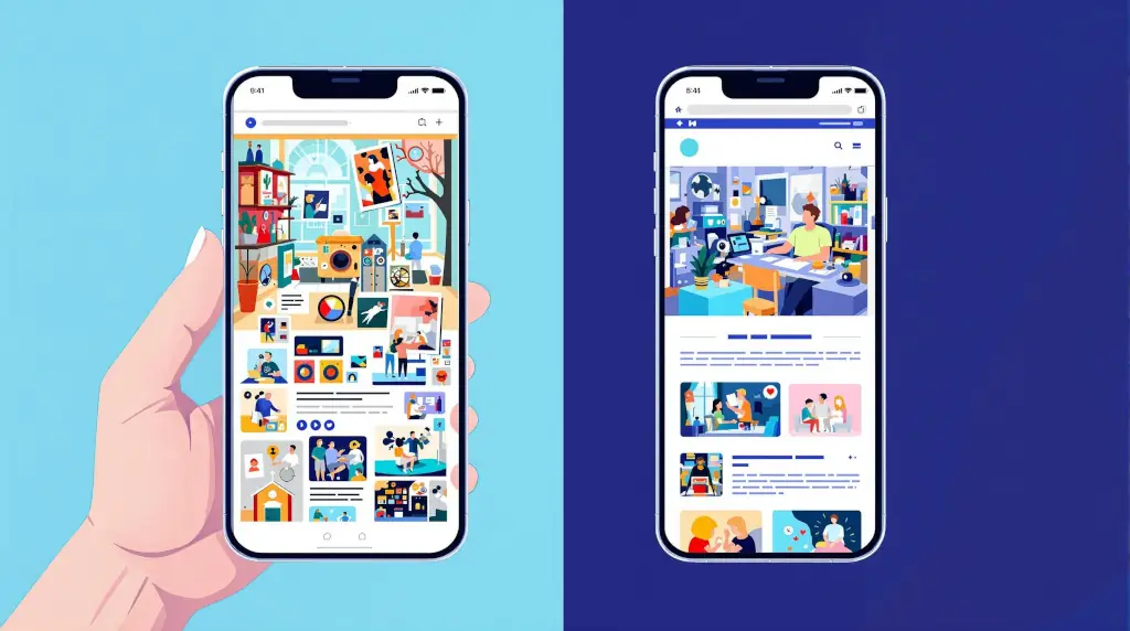
Non-responsive web design is exactly what it sounds like—a website that doesn’t respond or adapt to different screen sizes and devices. Instead of gracefully adjusting its layout, images, and navigation for smartphones and tablets, these sites remain fixed in their desktop format, creating a frustrating mobile experience that pushes users away.
The Mobile-First Reality That’s Reshaping Business
The statistics surrounding mobile usage in 2025 paint a clear picture: mobile devices now account for about 60% of all web traffic globally, with some industries seeing mobile usage rates exceeding 70%. More telling are the bounce rate statistics: websites with poor mobile optimization experience bounce rates that are 40-60% higher than their mobile-friendly counterparts.

This becomes particularly painful for businesses: mobile users who encounter a poor experience are five times more likely to abandon your site permanently and 67% less likely to complete purchases or desired actions. When you consider that the average small business website receives 60-80% of its traffic from mobile devices, the revenue impact becomes staggering.
The SEO Penalty You Can’t Afford to Ignore
Google’s mobile-first indexing means your website’s mobile version is now the primary factor in how your site ranks in search results. Sites that aren’t mobile-optimized forfeit both visitors and search visibility entirely. This creates a compound effect where poor mobile design leads to lower search rankings, which leads to less traffic, which ultimately results in fewer customers and reduced revenue.
Why Mobile-First Website Design Isn’t Optional for 2025 Success
Consumer Behavior Has Fundamentally Shifted
Today’s consumers not only prefer mobile—they expect mobile excellence. The modern customer journey typically begins on a mobile device, whether someone is researching services during their commute, comparing prices while in a store, or seeking immediate solutions to urgent problems.
This shift has created what digital marketers call “micro-moments,” which are brief windows when consumers turn to their devices for quick answers. If your website can’t deliver information quickly and clearly on a mobile screen, you’re essentially invisible during these critical decision-making moments.
Consider this: 53% of mobile users will abandon a website if it takes more than three seconds to load, and 79% of users who encounter a poor mobile experience will search for another site to complete their task. These statistics represent real customers walking away from real business opportunities.
The Business Advantage of Mobile Excellence
Businesses that prioritize mobile user experience gain a significant competitive position. When your responsive design allows customers to easily navigate your services, read testimonials, and contact you directly from their mobile device, you’re meeting and exceeding expectations.
This advantage becomes even more pronounced in local markets. Mobile users conducting local searches are three times more likely to visit a business with a mobile-optimized website within 24 hours. For service-based businesses and local companies, this translates directly into foot traffic, phone calls, and new customer acquisitions.
The businesses that are winning in today’s market understand that mobile-first web design is about respecting your customers’ time and providing them with the seamless experience they’ve come to expect from every interaction with your brand.
How to Assess Your Site’s Mobile Friendliness: Tools and Techniques That Reveal the Truth
Before you can fix mobile design issues, you need to understand exactly where your website stands. The good news is that Google provides several free tools that give you detailed insights into your mobile performance—and I recommend every business owner bookmark these resources.
Essential Mobile Testing Tools Every Business Owner Should Use
Google’s Mobile-Friendly Test is your first stop for a quick health check. Simply visit Google’s Mobile-Friendly Test tool, enter your website URL, and within seconds you’ll receive a clear verdict on whether Google considers your site mobile-friendly. More importantly, the tool provides screenshots showing exactly how your site appears on mobile devices and highlights specific issues that need attention.
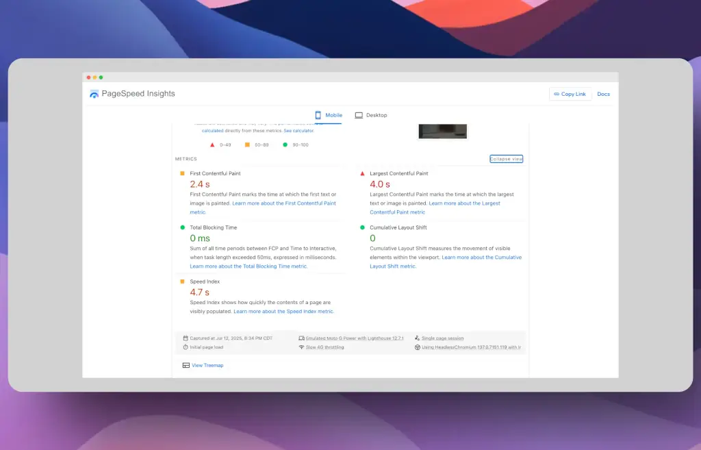
Google PageSpeed Insights with Lighthouse provides deep analysis. This tool measures your site’s performance on both mobile and desktop, providing separate scores for each. Pay particular attention to the mobile score—anything below 50 is considered poor, 50-89 needs improvement, and 90+ is excellent. The tool also breaks down performance into specific metrics like Largest Contentful Paint (LCP) and Cumulative Layout Shift (CLS), which directly impact user experience.
For a more comprehensive audit, Google Search Console offers invaluable mobile usability reports. If you haven’t already connected your website to Search Console, this should be your immediate next step. The Mobile Usability section will flag issues like “text too small to read,” “clickable elements too close together,” and “content wider than screen”—all critical problems that drive mobile users away.
Step-by-Step Mobile Performance Audit
Here’s my recommended process for conducting a thorough mobile assessment:
- Start with the Mobile-Friendly Test – Get your baseline score and screenshot
- Run PageSpeed Insights – Focus on mobile performance metrics and Core Web Vitals
- Check Search Console – Review any existing mobile usability errors
- Test manually on actual devices – Nothing replaces real-world testing on smartphones and tablets
- Analyze your mobile traffic data – Use your preferred website analytics tool to identify mobile bounce rate patterns
When reviewing these results, look specifically for viewport configuration issues, touch element sizing problems, and loading speed concerns. These three areas account for the majority of mobile user frustration and are often the easiest wins for improving mobile experience.
Fixing Common Mobile UX Issues: Practical Solutions That Drive Results
In my work with businesses and ministries both locally and remotely, I consistently encounter the same mobile responsiveness challenges. Understanding these patterns helps you recognize similar issues on your own site and prioritize improvements that deliver the most impact.
Layout and Navigation Problems That Kill Conversions
The most common mobile UX issue I encounter is what I call “desktop-trapped design”—websites that force mobile users to navigate layouts designed exclusively for larger screens. The primary culprit is fixed-width layouts that don’t adapt to smaller screens, forcing users to scroll horizontally or zoom constantly to read content.
The fix: Implement fluid grid systems that use percentage-based widths instead of fixed pixel measurements. If you’re using WordPress, switching to a responsive theme is often the quickest solution. Look for themes that specifically mention “mobile-first design” or check the theme preview on different screen sizes before making your selection.
Navigation menus present another major challenge. Desktop navigation with multiple dropdown levels becomes unusable on mobile screens. Users end up accidentally triggering hover states or struggling with tiny click targets that are impossible to tap accurately.
The solution: Convert complex navigation into mobile-friendly hamburger menus or collapsible navigation systems. Ensure that all clickable elements are at least 44 pixels in size—Google’s recommended minimum touch target size. For WordPress users, many mobile responsive themes automatically handle this conversion, but always test the functionality on actual mobile devices.
Content and Media Optimization Strategies
Text readability consistently emerges as a major barrier. Font sizes that work perfectly on desktop become microscopic on mobile, forcing users to pinch and zoom just to read your content. This immediately signals to visitors that your site wasn’t designed with their mobile experience in mind.
Quick fixes that make a big difference:
- Set your base font size to at least 16px for body text
- Ensure sufficient line spacing (1.4 to 1.6 line height ratio)
- Use high contrast color combinations for better readability
- Break up large text blocks with subheadings and bullet points
Image optimization represents perhaps the biggest opportunity for immediate mobile improvement. Oversized images that haven’t been optimized for mobile devices dramatically slow loading times and consume excessive mobile data—two factors that will send users running to your competitors.
WordPress-specific solutions:
- Install responsive image plugins like Smush or ShortPixel for automatic optimization
- Use WordPress’s built-in responsive image features (available since version 4.4)
- Implement lazy loading to improve initial page load speeds
- Consider WebP image formats for faster loading without quality loss

WordPress Plugins and Themes for Enhanced Mobile Performance
For WordPress users, several plugins can dramatically improve mobile friendliness without requiring coding expertise. Litespeed Cache handles caching and performance optimization and can combine and minimize CSS and JavaScript files to reduce loading times.
AMP (Accelerated Mobile Pages) plugins create lightning-fast mobile versions of your pages, though this approach requires careful consideration as it creates separate mobile URLs. For most small businesses, I recommend focusing on mobile-first design improvements rather than implementing AMP.
When selecting responsive themes, prioritize those that specifically mention mobile-first design principles. Always preview themes on multiple devices before making your final decision.
The Mobile Optimization Process: What Results-Driven Businesses Can Expect
Common Mobile Issues I See in Client Assessments
In my work with businesses across Sioux Falls and beyond, I consistently encounter the same mobile display challenges. Understanding these patterns helps business owners recognize similar issues on their own sites and prioritize improvements that deliver the most impact.
Navigation and Usability Problems: Most non-responsive sites I evaluate suffer from navigation systems designed exclusively for desktop use. Small touch targets, overlapping menu items, and hover-dependent functionality create immediate friction for mobile users. These issues are particularly problematic for service-based businesses where customers need quick access to contact information or service details.
Content Presentation Challenges: Text readability consistently emerges as a major barrier. When font sizes remain fixed for desktop viewing, mobile users encounter content that’s simply too small to read comfortably. This forces the pinch-and-zoom behavior that signals poor mobile optimization and typically leads to immediate site abandonment.
Performance and Loading Issues: Image optimization represents the biggest opportunity for quick wins in mobile performance. Sites loading multiple high-resolution images without responsive sizing often take 8-10 seconds to fully load on mobile devices—far beyond the 3-second threshold where most users abandon the page.
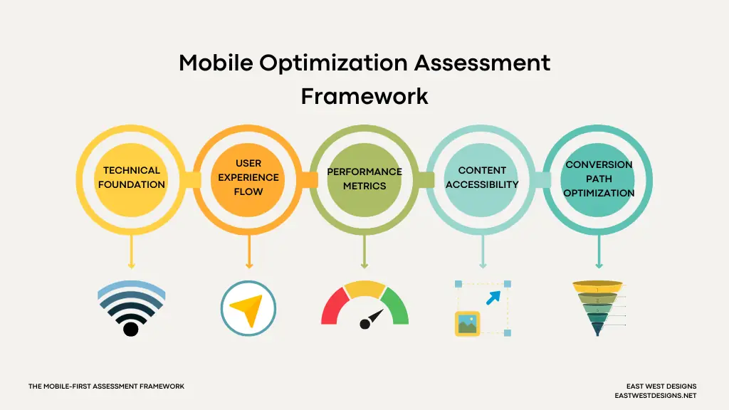
The Mobile-First Assessment Framework
When evaluating a client’s mobile readiness, I focus on five critical areas that directly impact business outcomes:
- Technical Foundation – Proper viewport configuration, responsive breakpoints, and mobile-friendly code structure
- User Experience Flow – How easily can mobile users complete desired actions like contacting the business or finding key information
- Performance Metrics – Page load speeds, image optimization, and Core Web Vitals scores
- Content Accessibility – Font sizing, touch target spacing, and information hierarchy on small screens
- Conversion Path Optimization – How seamlessly mobile users can move from visitor to customer
This systematic approach ensures that mobile improvements align with actual business goals, a huge win over just checking technical boxes.
Timeline and Expectations for Mobile Optimization
Most responsive design implementations follow a predictable improvement pattern. Initial technical fixes, like implementing breakpoints and optimizing images, often show improvements within the first few weeks.
More substantial improvements in user engagement and conversion rates usually become apparent 30-60 days after implementation, as search engines recognize the improved mobile experience and user behavior data accumulates. The key is tracking the right metrics from the start: mobile bounce rate, time on site from mobile devices, and completion rates for key actions like form submissions or phone calls.
East West Designs’ Mobile-First WordPress Optimization: Your Path to Mobile-Friendly Design
Since 2015, I’ve focused exclusively on WordPress development because it powers over 43% of all websites—and yet, many WordPress sites still struggle with mobile optimization. The platform’s flexibility is both its strength and its challenge when it comes to mobile-first web design. While WordPress offers incredible customization options, those same options can create mobile usability problems if not implemented with mobile-first principles.
Why WordPress Mobile Optimization Requires Specialized Expertise
My approach to WordPress mobile optimization goes beyond simply installing a responsive theme. I provide comprehensive mobile audits that examine your current setup, identify specific barriers to mobile performance, and implement solutions that align with your business goals. There are no one-size-fits-all fixes, so I strive to understand how your specific audience uses mobile devices to interact with your business.
The East West Designs Mobile Optimization Process:
- Complete mobile usability audit using professional-grade tools
- Performance analysis focusing on Core Web Vitals and mobile-specific metrics
- Custom mobile-first implementation tailored to your industry and audience needs
- Ongoing optimization and monitoring to maintain peak mobile performance

Comprehensive Services That Address Every Mobile Challenge
WordPress Theme Optimization and Customization
Many businesses assume that switching to a “responsive” theme automatically solves their mobile problems. In reality, most themes require customization to truly serve your specific business needs.
I work with advanced WordPress page builders like Oxygen Builder 6 and LiveCanvas that give me complete control over mobile-first design implementation, rather than relying on pre-built themes with unnecessary code bloat that slows mobile performance. This approach allows me to create fully custom desktop and mobile experiences that reflect your brand while prioritizing user functionality and optimal loading speeds.
Performance Optimization for Mobile Speed
Mobile users expect fast-loading sites, and Google’s algorithm increasingly prioritizes speed in mobile search rankings. My optimization process includes image compression and optimization, CSS and JavaScript minification, caching implementation, and database cleanup—all specifically configured for optimal mobile performance.
Mobile-First Content Strategy
Content that works well on desktop often needs restructuring for mobile consumption. I help clients reorganize their information architecture, optimize content hierarchy for mobile users, and ensure that key business information is accessible within the first few seconds of a mobile visit.
Ongoing Mobile Performance Monitoring
Mobile optimization is not one-and-done—it requires ongoing attention as your business grows and mobile technology evolves. My clients receive regular mobile performance reports, proactive issue identification, and updates to maintain optimal mobile functionality.
The East West Designs Advantage: Local Expertise with Global Standards
Working with a certified SEO expert who understands both WordPress development and mobile optimization means you’re getting solutions that serve both your users and search engines. My approach combines technical expertise with practical business understanding—I know that your mobile optimization needs to drive real business results, not just improve technical scores.
What Sets Me Apart:
- Personalized service with direct access to an experienced developer
- Focus on business outcomes, not just technical metrics
- Comprehensive understanding of WordPress, SEO, and mobile optimization
- Ongoing support and optimization as mobile standards evolve
- Transparent communication throughout the optimization process
Based in Sioux Falls, I work with businesses locally and remotely, providing the same level of dedicated service regardless of location. Whether you need a complete mobile redesign or targeted improvements to existing responsive elements, I deliver solutions that transform your mobile user experience into a business advantage.
Staying Ahead: The Future of Mobile-First Web Design and Your Strategic Edge
The mobile landscape continues evolving at breakneck speed, and businesses that want to stay competitive must think beyond today’s responsive design standards. As we look toward the remainder of 2025 and beyond, several trends are reshaping what users expect from mobile experiences.
Emerging Mobile Technologies and User Expectations
Progressive Web Apps (PWAs) are becoming the new standard for mobile engagement, offering app-like functionality through web browsers. Faster 5G networks are raising the bar for loading speed expectations, while voice search and AI-powered browsing are changing how users interact with mobile content. The businesses that thrive will be those that view mobile optimization not as a one-time project, but as an ongoing commitment to meeting evolving user needs.
Your mobile user experience today sets the foundation for tomorrow’s success, but only if it’s built with scalability and adaptability in mind. This is why working with an experienced developer who understand both current best practices and emerging trends becomes crucial for long-term digital success.
Taking Action: Your Next Steps Toward Mobile-First

The cost of delaying mobile optimization grows steeper every day. While your competitors are losing potential customers to poor mobile experiences, you have the opportunity to capture those users by providing the seamless, mobile-friendly experience they expect.
Start with the assessment tools mentioned in this article—Google’s Mobile-Friendly Test and PageSpeed Insights will give you immediate insight into your current mobile performance. But remember, identifying problems is only the first step. The real value comes from implementing solutions that transform your mobile experience from a barrier into a bridge connecting you with your customers.
Whether you choose to tackle mobile optimization internally or partner with a WordPress specialist, the key is taking action now. Every day you wait is another day of missed opportunities, frustrated mobile users, and lost revenue to competitors who prioritized mobile-first website design.
At East West Designs, I’ve seen the transformative power of responsive web design benefits firsthand, not just in improved metrics, but in real business growth and customer satisfaction. Your mobile experience is often the first impression potential customers have of your business. Make it count.
Transform Your Mobile User Experience Today
Don’t let poor mobile design cost you another customer. Get a comprehensive mobile optimization assessment that identifies exactly what’s holding your website back and discover how mobile-first website design can become your strategic advantage.